Lean Six Sigma Toolbox
A Simple, Visual Look at COVID-19 Data
A friend and business partner of mine was diagnosed with COVID-19 this week. I was already obsessed with how viruses spread but this really brought it home.
So I pulled up some Data, because let’s be honest, everyone
is worried about it and we don’t have any sports stats right now… so why not?
Source: https://www.worldometers.info/coronavirus/#countries
Normally a Lean Six Sigma guru like myself will use a control
chart to analyze this type of data. But I’m exhausted from doing my 10 year old’s
math homework so I thought, “What if we look at COVID-19 data using simple
color coding in Excel and see if anything stands out?”
(My Lean Sensei taught me
PGA, analyze data Practically first, the method I’m showing here, then Graphically,
then Analytically)
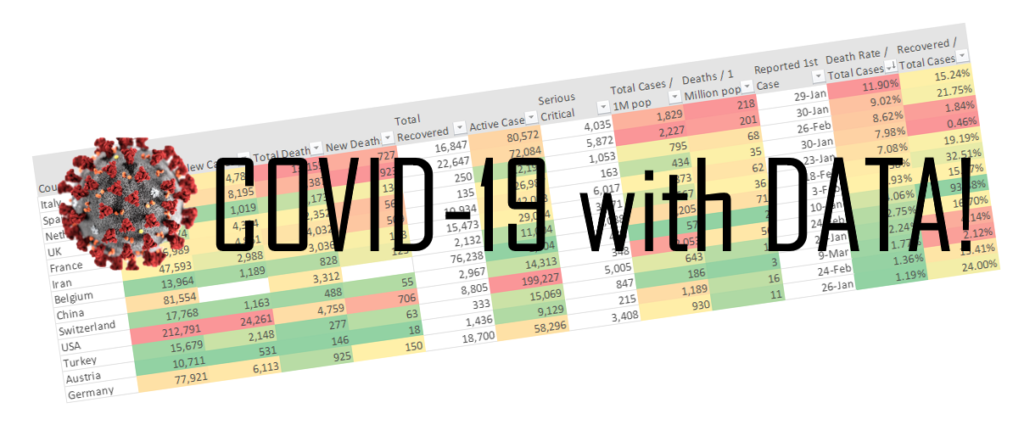
A Simple Visual Approach
I filtered out any countries with fewer than 3,000 cases of the Corona Virus. Then I used conditional formatting in each column to make anomalies stand out. The last 2 columns show the data normalized to the number of cases so countries with higher or lower populations aren’t singled out. Finally I sorted the Death Rate / Total Cases column from largest to smallest.
What do we see?

- Well Italy and
Spain are having a rough go. Check out the Deaths per 1 Million population column.
Their data is RED. If you test positive you have a 1 in 10 chance that this
will be a very bad week.
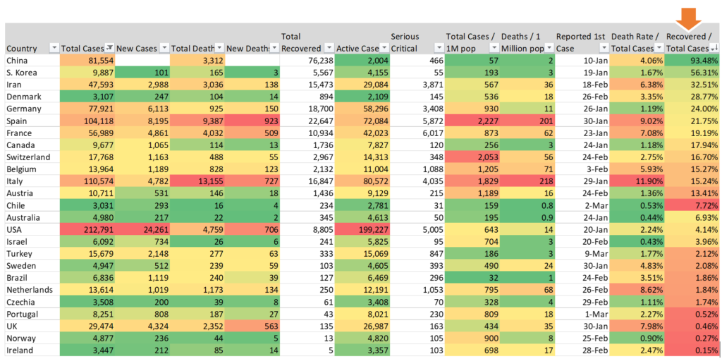
- Good news! The United States is toward the
bottom of Deaths / Total Cases for countries with over 10,000 cases. In this chart,
countries with over 3000 cases, the U.S. is yellow but almost green. We’re
better than 1/2 of the countries on the list. Of course green doesn’t mean it’s
good, just better. And since percentages often trick us into a false sense of
security, a 2.24% death rate, which seams small, means 1 in 50 people who test
positive die. Those aren’t great odds.

- And what about
that random green box in Recovered / Total Cases? China has a 93% recovery
rate? That seems weird. Is China a statistical anomaly?
What is a statistical anomaly?
When you look at a process you can see if it is “in control” or not when you see data points that are highly unlikely to occur. There are rules for this. And China definitely stands out (geeks: check out the confidence interval for this sample in the table below). The second highest recovery rate is South Korea coming in at 56%. Why are the Chinese recovering at a much higher rate?
THEORY A: China is on the mend. The virus has run its course. Everyone is getting healthy and everyone else is lagging behind.
THEORY B: China is underreporting their death rate.
Pick your conspiracy theory or just chalk it up to leaders who don’t want to admit they have a problem. I don’t have a dog in this fight, but I do like looking at the data. It tells a story all on its own. And using data I can come to my own conclusions on how likely I am to survive this… or just driving to work. If I stay home I’m safe from both!
Stats for Geeks (Normal people move on… nothing to see here.)

Do you trust your data?
Are those death rates accurate? It’s important to note how differently each nation not only reports their data but collects it. The number of actual cases in a country may differ due to several factors.
- How many people have the virus but minor or no symptoms?
- How many people have symptoms but are never tested?
- How many of those people go in to be checked vs. toughing it out?
- How many tests are available?
- How accurate are those tests? Are there false positives?
Given these factors your raw data could send you on a magic mushroom trip to a realm that is not reality. There is a margin of error in the data.
Conclusion
It’s good to be an American. But it’s better to be Australian. Nobody is dying from Corona there. Do I trust the data? Some of it. Are we going to make it through this? Yes we are!
Fun (?) Facts:
- The “normal” flu kills over 55,000 Americans each year.
- Drunk driving kills over 10,000 Americans each
year. Now there’s a 100% preventable virus we could be working on.
https://www.cdc.gov/nchs/data/nvsr/nvsr68/nvsr68_09-508.pdf
I hope you will dig into some data today, if not for the Corona Virus then for your own business. Go get it, make it visual, and see what it tells you. It’s easier than you think. And maybe just a little fun.
